Campaign Trail is our analysis of some of the best new creative efforts from the marketing world. View past columns in the archives here.
When it comes to brand identity, few are more recognizable than McDonald's. From its logo and jingle to tagline and mascot, the fast food giant benefits from decades of equity in its trademarks and traditions.
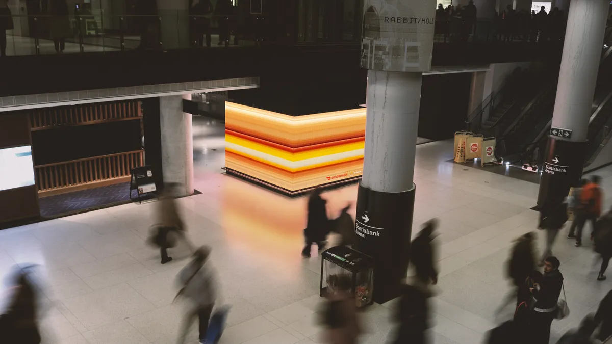
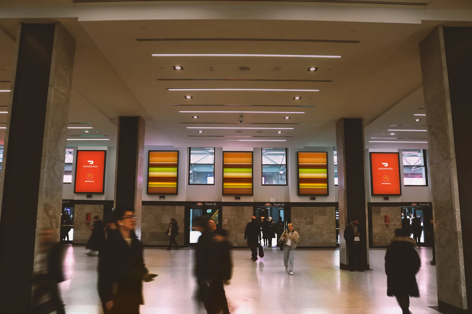
That familiarity flows all the way down to its flagship menu items, an insight tapped into by delivery platform DoorDash and agency No Fixed Address for a campaign that ran in Canada in March. Central to the effort were both traditional and digital out-of-home placements in Toronto's Union Station and Yonge–Dundas Square that reduced menu items to their essential elements.
"McDonald's food is iconic; it's an iconic brand," said Alexis Bronstorph, co-chief creative officer at No Fixed Address. "We knew we really wanted to show the benefit of the partnership and the way that, with DoorDash, McDonald's delivery comes that much faster."
As part of the DoorDash's "Faster Food” effort, No Fixed Address turned the Big Mac and the Egg McMuffin into bars of color that suggest motion blur — while maintaining the food's familiarity — to combine the speedy proposition of DoorDash with the iconography of McDonald's.
"McDonald's lends itself to being able to be that much more abstract because you still have that legibility of its offerings," explained Reid Plaxton, senior art director at No Fixed Address. "We tried a lot of different ways in terms of representing it — blurring it, swishing it — and this is ultimately our landing spot."
Reductivism
The final work from No Fixed Address represents the latest iteration of campaigns that look to represent and reduce McDonald's menu items in eye-catching ways that play off the brand's iconic status. In separate efforts, agency Cossette turned menu items into paint swatches and assembled them from home goods to commemorate Quebec's annual Moving Day tradition. In 2020, Monotype used a minimalist approach with type-only ads that omitted food all together.
While those campaigns were made for the brand itself, No Fixed Address had the unique challenge of utilizing an additional — and more familiar — brand identity to contextualize its own client's value proposition. Strong ties between partners was key.
"Our relationship with DoorDash is super collaborative," Bronstorph said. "They're in the room with us talking about creative; we have brainstorming sessions. We were really excited to share this one because it was so simple."
The design process involved Plaxton generating 200-color tables from food images by meticulously selecting each color present — the lettuce, the highlights in the lettuce, the shadows where the lettuce hits the bun and so on. From there, he went layer-by-layer (bun, burger, cheese, for example) and stretched out the key colors, adding highlight and shadow colors to add depth.
"We didn't necessarily say, 'This is Lettuce Green,' but we did end up staying completely true to the colors that you can find it the Big Mac," he said.
This approach proved effective for the Big Mac and Egg McMuffin, but not all iconic food items were a good fit. There's an image of the relatively monochromatic Filet-o-Fish in an "ad graveyard," Bronstorph joked.
While the images pop in print and static OOH formats, they really shine as digital OOH activations that allow for true movement and animation. Media placements at Union Station — Toronto's biggest transit hub — aligns fast moving food with commuters who are also whizzing by. One placement used nine screens over a 40-foot concourse area to show the food item in motion before revealing the DoorDash branding, while placements around columns and pillars put the images in constant rotation.
"[DOOH] allowed the Big Mac to travel and live on its own, while also allowing a lot of space for the DoorDash delivery logo to live," Plaxton said. "Being able to have that animation where the Big Mac spins across and then leaves that nice DoorDash brand — the red color and their logo — was another cool thing in terms of comprehension."
Doubling down on movement allowed the campaign to zero-in on its key elements: those iconic McDonald's menu items delivered by DoorDash. No slogans, taglines or deal copy were necessary.
"When you don't have to say a lot in an ad, it's usually pretty special,” Bronstorph said.


